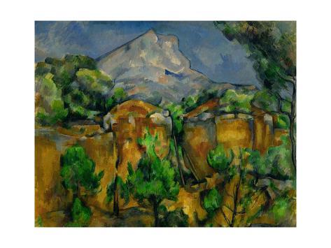
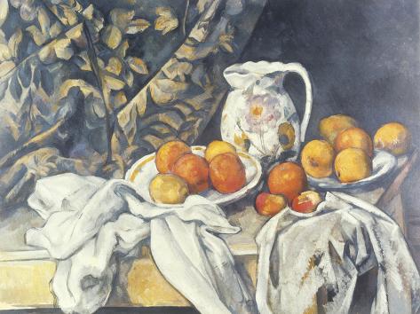
The Impressionist palette, no matter how wild the paintings may have seemed to be at the time, was restricted to only about a half-a-dozen colors – and the palette eliminated black altogether. It relied heavily on using complementary colors to create light and shadow instead of gray tones or black added to color to make it darker. Cézanne, on the other hand, used a color system that he called modulation – and its subtle gradations in color – which required a larger range of colors to work from. Rather than mix colors on his palette to create new colors, he liked to use his colors directly from the tube (as we say today).
There were two methods of showing light and dark in Impressionist painting. Modeling, created shading from light to dark, for example gradating a blue object from a light blue to a dark blue. Modulation instead expresses light to shadow/dark by using warm to cool colors.
According to Emile Bernard, Cézanne habitually used no less than nineteen colors: Cobalt Blue, Ultramarine, Prussian Blue – Emerald Green Viridian, Terre Verte – Vermilion, Red Ochre, Burnt Siena, Rose Madder, Carmine Lake, Burnt Lake – Brilliant Yellow, Naples Yellow, Chrome Yellow, Yellow Ochre, Raw Siena – Silver White and Peach Black. This list was made in 1904, towards the end of Cézanne’s life, but from about 1880 onward his palette remained substantially unchanged. — Gerstle Mack, Paul Cézanne
[bctt tweet=”The Impressionist palette, no matter how wild the paintings may have seemed to be at the time, was restricted to only about a half-a-dozen colors – and the palette eliminated black altogether.”]